My exhibition, (Be)Longing, has closed, but the book of the same title, which I have printed for the show, is here to remain. I am pleased with the book. The layout is nice, and the reproductions of my prints came out really well. I’d like to share a few thoughts about the process, and the people, who helped me get it printed. Of course, you can buy it here, too.

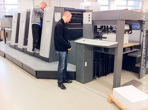
Janusz Moskiewicz, Chief of Production (left) Suggests Ink Delivery Adjustments to Paweł Dziurdzia, Print Supervisor (right)
The hardest part in planning of the book’s project was the decision about the printing technique, which ought to be as faithful as possible to the prints. I had three requirements: the resolution had to be good, the tonality (contrast) representative, and the tone (colour) as close to the subtle plum tones that selenium produces on the photographic paper, which I like using in my wet darkroom. Together with my designer, Rafał Sosin, we settled on tritone offset. After some testing, we chose to use a mixture of a 400 dot screen for Pantone Cool Gray 6C and Pantone 663C (a light purple) inks, and a stochastic screen for the process black ink. The gray and black combination built a good contrast with juicy midtones, while the 663C provided the selenium tone, which I so very much wanted. Having done a fair bit of research, and having chatted to several printers, I felt we have made a good discovery, as I have not found anyone who had used this combination, or in fact, who has previously published any information on how to reproduce the specifics of selenium tone in offset printing. The use of the stochastic screen for the black ink has given us a much better contrast in the highlights, especially in the clouds, which do have some small, but important areas of pure white, with only an occasional dot of ink.
Another major decision, which I had made at the beginning, was that I was not going to use scans of my large format negatives, but instead I decided to take digital photographs of the actual, finished wet-darkroom prints. I wanted the book to be faithful, and I felt that using scans would, perhaps, create an image that was sometimes better, sometimes worse, but never true to the hand-made print. It is not easy — not for me — to duplicate, digitally, the hand burning and dodging that is applied during the printing process under the enlarger.
After debating the choice of a paper, we decided on a nice matte 170 gsm bright white. The hard cover was bound in another paper, overprinted with plain CoolGray 6C, which provided continuity with the prints inside the book. We decided not to use any varnish, except on the cover, due to its slight yellowing properties — I wanted the prints not to have any suggestion of sepia, which I feel does not agree with my subjects.
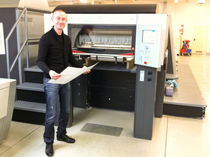
The best part of the entire experience was the day at the printing shop. Watching the presses deliver sheets containing my prints was magical. Being able to assist the operators in adjusting the flow rates of the three inks, in little vertical strips that run top-down of each page, was the final bit of the mystery in the process that led to the results I desired. It was that very final adjustment, sometimes very subtle, which got the printed pages to have a glow, which is often hard to find in black-and-white, photographic albums. The patience and the experience of the machinists, operators, and the chief of production was a big part of the success. Being able to spend a full two days on-site, supervising what is only a small job of 64 pages with 24 prints, was my good good luck of having chosen a very understanding press (Drukarnia Skleniarz) in Kraków, the city of my birth, and the place where my exhibition took place. Had I not been there, in person, the book would have been probably fine. On the other hand, the feedback I was able to give to the staff meant they knew exactly what I was looking for, and they reciprocated by being creative and ready to suggest interesting solutions to the issues we have encountered. For example, the idea of mixing a regular raster with a stochastic one was suggested, on the day, by Mr Janusz Moskiewicz, Chief of Production. Later, they told me, that they wished every author was on-site when their book was being printed. I suppose they wished none would be as demanding of their time as I was…
If possible, I would recommend that anyone who prints black-and-white photographs, digitally, or traditionally, should consider having their pictures printed in a book, a traditional one, rather than made on an inkjet or a laser printer, at least once in their life. It was an incredible learning opportunity for me, which taught me more about my work, but also a wonderful, very enjoyable two days, and an elating experience. I won’t forget the smile I had on my face when I saw my prints appear on page of a book for the first time — it was one of the happiest days of my life.


2 Responses to How to Print a (Traditional) Book of Black-and-White Photographs?